

Focus management is crucial in ensuring your digital product's usability and, most importantly, accessibility. Still, it’s often forgotten. We will discuss the most common issues with focus management, their impact on different types of users, and how to test them.
When designing and developing a new website or application, we pay little attention to the management of elements in focus. Why is that? Because the focus isn't something we explicitly see. Yet, it's one of the most crucial elements ensuring your digital product's usability and, most importantly, accessibility.
Rephrasing Jared Spool1, good focus management, when it’s done well, becomes invisible. It’s only when it’s done poorly that we notice it.
Ever found yourself filling out a form, hitting the tab to jump to the next field, only to find that you didn't land where you expected? That's a classic case of poor focus management.
In this blog post, we will see the most common issues with focus management we noticed during our accessibility assessments, the impact on different types of users, and how to test them.
Just as it happened in our previous example, anyone can encounter issues with focus. However, if we're navigating with a mouse, we might not always realize whether the focus is being managed well or poorly.
Yet, particular specific groups of people are significantly more affected by inadequate focus management:

The elements of focus that can impact the navigation experience of these types of users are:
"But you said that good focus management is invisible!"
Yes, but the focus itself is not.
Focus is a state that, while navigating with a mouse, we only tend to see when we're typing into a form field. The default focus style is not the prettiest component on the web, so many designers simply opt to eliminate it.
If you've clicked on a form field, it's obvious that you'll be typing in there. But what if you've landed there by navigating with the tab key on your keyboard? How would you know where you are?
The answer lies in the focus state. Without this focus state, those who navigate using the keyboard or other assistive technologies have no idea where they are on the page.
So, including a focus state for every interactive element in the user interface is crucial. Perhaps something more attractive than the default style (people with disabilities are still entitled to beautiful user interfaces!).

At this point, you should have a good understanding of how focus works. If the visibility of focus is your "you are here" marker on a map, then the focus order is the list of metro stops.
Think of it like this: when you get to the metro, you'd look at the map with the stop list. So, if you're in Milan and get on the subway at the Duomo, you'd expect the next station to be San Babila. If you instead ended up somewhere unexpected, you'd understandably be bewildered.
Users who navigate by keyboard see the interface elements and therefore expect their navigation to follow the same order, so they can predict where they're going to land next. If the focus order is poorly managed, they lose this predictability. They'd have to proceed forward, hoping to eventually land on their element of interest. This experience can be frustrating for keyboard users, but it’s a real obstacle for those using assistive technologies due to mobility difficulties. It could take them considerable time to locate their item of interest.
Returning to the metro example, imagine if this happens and you're visually impaired. People who navigate with screen readers don't even have the opportunity to see the interface elements on the page. Therefore, it's even more imperative for them that the focus order follows a logical and predictable sequence.
To ensure that the focus order is correct, there are tools available that display the sequence in which the interface elements take focus. This allows you to verify that the order matches what one would expect by looking at the sequence shown by the tool.
At Buildo, we use Taba11y, a Chrome extension, to check the focus order. (If you want to learn more about how we test accessibility at Buildo, read our case study).
Other two common errors in managing focus order are keyboards traps and focusable hidden objects.
A keyboard trap occurs when a user is unable to navigate away from a specific element using the keyboard, effectively trapping them within that element. This could happen, for example, with poorly designed select fields, where the user can no longer exit the component's menu.
Focusable hidden objects are elements that are hidden from sight but still focusable, leading to confusion and a disrupted navigation sequence. In this case, the user can't see where their focus is because the focused object isn't visible. Thus, they don't know where they are within the interface and how to get out. An example of hidden objects that could inadvertently gain focus is the content within accordion elements.
A component that poses potential problems with focus management is the modal. When developing a modal, you need to be mindful to "trap" the focus within it (essentially a reverse keyboard trap!), preventing it from shifting onto elements located beneath the overlay.
These checks are sufficient to allow your product to be navigable for those using the keyboard or assistive technologies (instead of having numerous poor users wandering lost in the subway tunnels…).
However, there's a difference between "being able to navigate" and "having a good user experience.” There's another obstacle for this category of users: extended groups of interactive elements that aren't the page's main content. I'm talking about over-stuffed menus, sidebar menus, or extensive filter groups.
Taking for granted that no one likes menus with eighteen items, they could be even less appealing for those who have to go through them one by one because they can't simply scroll to the main content. It's especially tedious if they have to repeat this process for every page they visit.
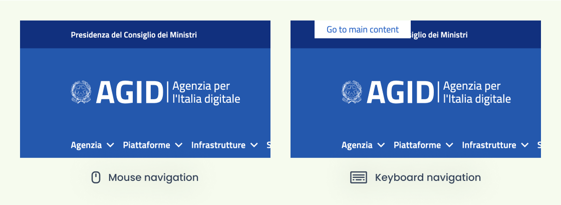
Therefore, it's essential to include a shortcut that brings users to the page's main content in a single click.
"Oh no, but I don't like having a link above the menu!"
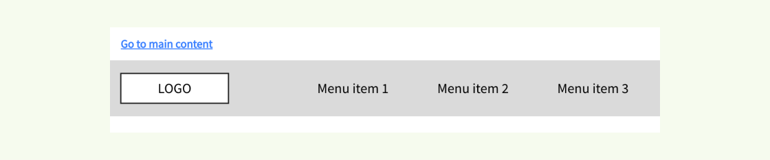
Lucky you, this link doesn't need to be visible to everyone! The feature should be available to users who need it, appearing only when navigating via the keyboard or assistive technology.
While we're on the subject, sometimes it can be beneficial for this feature not only to include a shortcut to the main content but also to provide links to the various sections that compose the page, especially if it's fairly extensive. This strategy immediately guides users to the content that interests them.
To conclude, proper focus management is essential for many users, who would otherwise be completely shut out from engaging with your product.
The good thing about focus management is that if components and pages are properly set up from the beginning, no additional effort is needed to ensure a smoothly navigable experience. In fact, mistakes often stem from unnecessary interventions rather than the lack of them (for example, misuse of the tabindex attribute).
By giving focus management the attention it deserves from the beginning, you can ensure a more accessible and usable experience for all your users, regardless of their abilities.
1 “Good design, when it’s done well, becomes invisible. It’s only when it’s done poorly that we notice it” Jared Spool, more on https://www.uie.com/
Sara is a designer at Buildo, specializing in User Research and UX. Her passion for research enables her to gain a deep understanding of users' needs and translate them into intuitive and user-friendly designs.
Are you searching for a reliable partner to develop your tailor-made software solution? We'd love to chat with you and learn more about your project.


