

Web accessibility is often associated with color contrast, but ensuring readable text against a background is not always straightforward. Even if the new APCA algorithm significantly advances the science behind choosing truly accessible colors, it's important to know the challenges and the downsides it presents.
When discussing web accessibility, the first thing that comes to mind is often colors. However, ensuring that text is readable against a background is not always as straightforward as it might seem. Today, we will see how legal standards may not always achieve the desired outcomes.
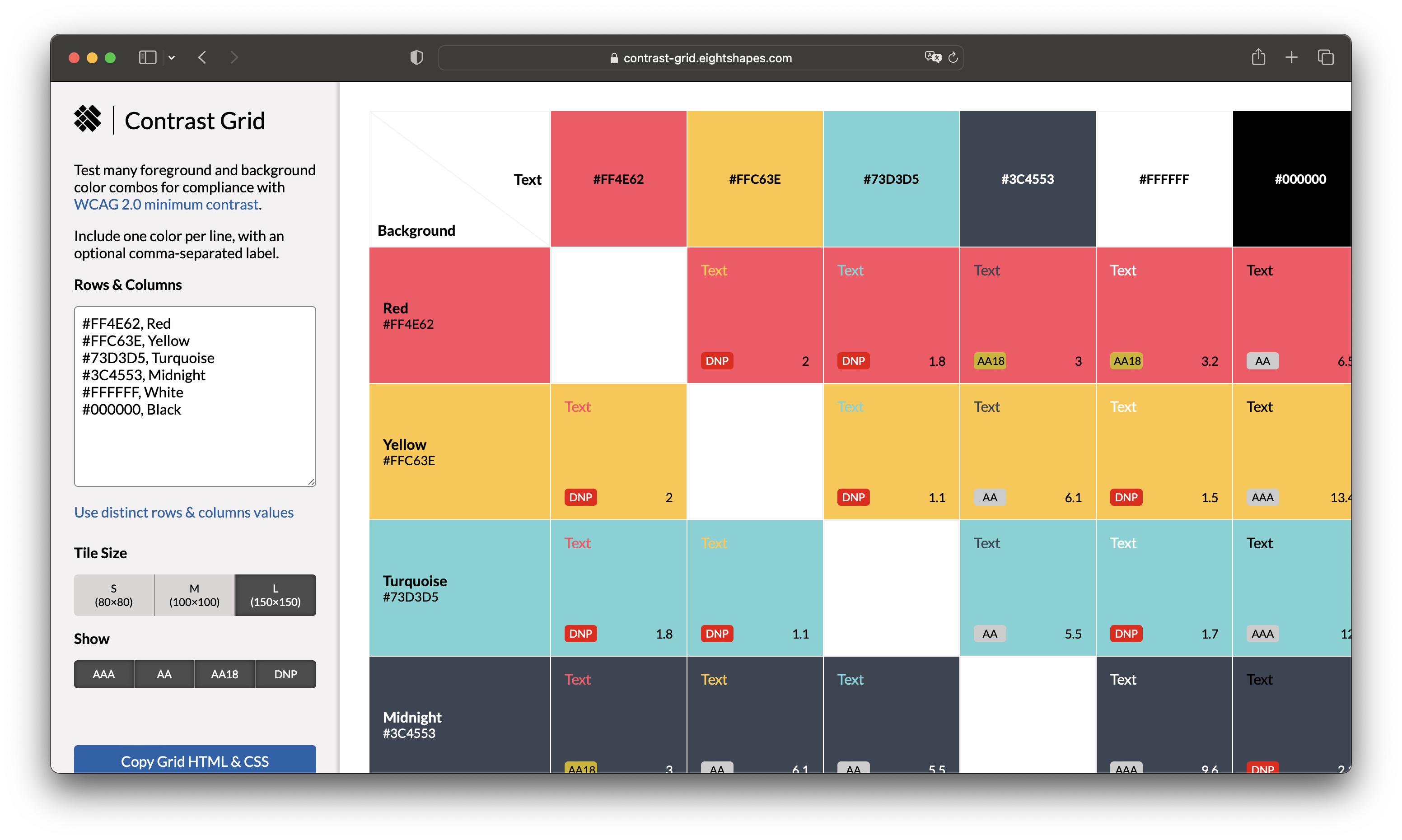
For years, the Color Contrast Ratio has been the established method for evaluating the contrast between two colors.
The method provides a numerical value indicating the contrast level between a background color and a foreground (typically text), calculated by comparing the relative luminance values of the colors using a formula based on their RGB or HSL values. In general, the higher the ratio, the better the contrast and legibility for users with visual impairments.
The WCAG guidelines, specifically Success Criterions (SC) 1.4.3, 1.4.6, and 1.4.11, establish specific requirements for color contrast, with varying levels of compliance (Level A, AA, or AAA) having different criteria. For instance, the AA level requires a minimum contrast ratio of 4.5:1 for normal text, whereas larger text (above 18pt or 14pt bold) has a lower requirement of 3:1.
However, the perception of contrast is not an inherent quality but a result of how our brains interpret visual differences. Surrounding elements and their intended purpose also influence it. Additionally, spatial characteristics such as font weight or line thickness significantly affect our brain's perception of lightness. Smaller and thinner fonts decrease perceived contrast, requiring a more significant lightness/darkness difference between the text and background color to compensate.

The WCAG 2 contrast guidelines were established in 2008 when display technology and web content vastly differed from today's standards. With the emergence of smartphones and tablets, the existing guidelines require a comprehensive overhaul to align with the advancements in computer display technology. This is where APCA comes into play.
The Accessible Perceptual Contrast Algorithm (APCA) is a new method for calculating and predicting the readability contrast of colors on self-illuminated RGB displays and devices, taking into account:
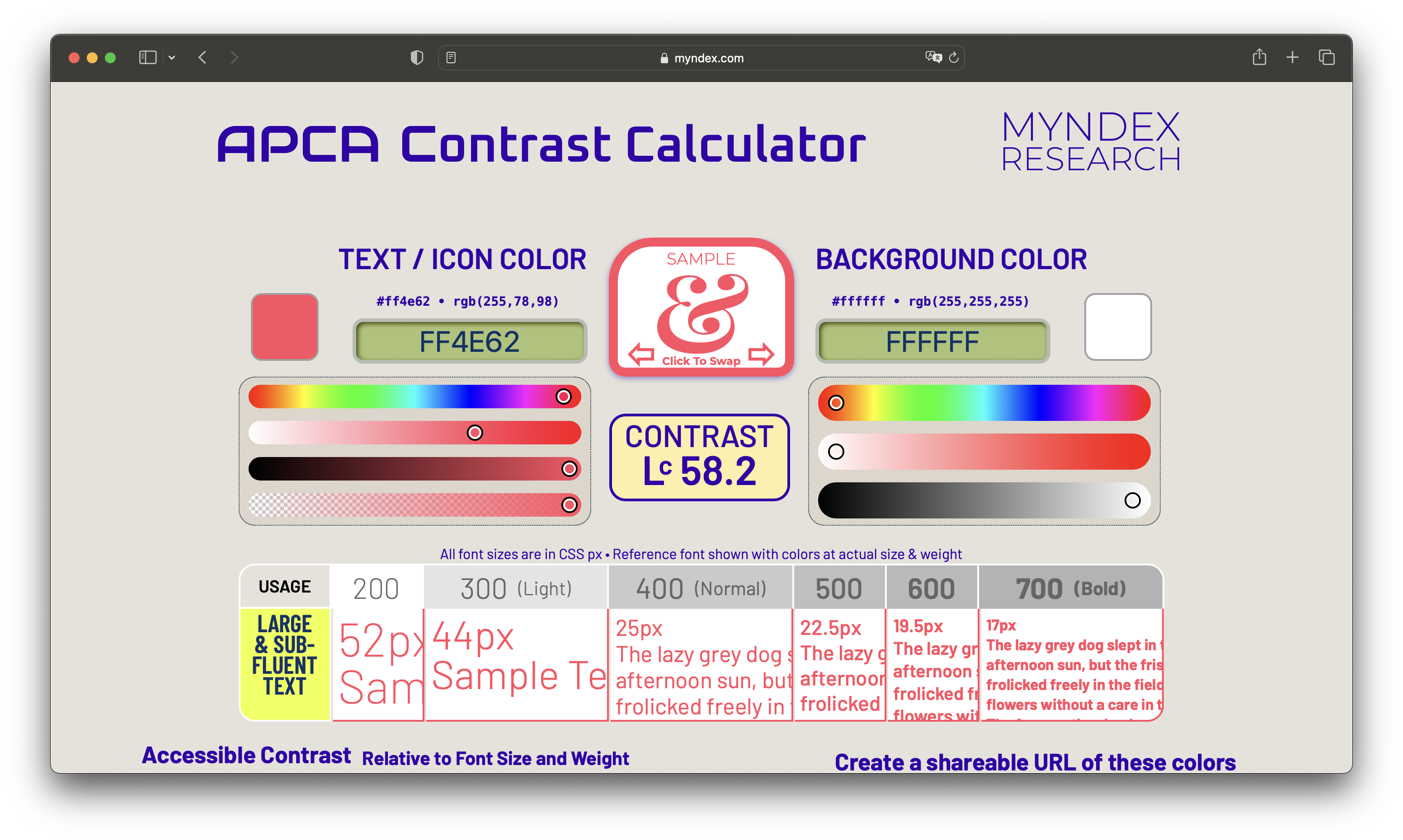
The APCA Contrast Calculator, developed by Myndex Research, is a powerful tool that offers valuable information using their algorithm. It calculates the Lightness contrast value and determines the minimum usable text size based on the font weight. This information helps to ensure that text is readable and accessible to users regardless of their visual abilities.
Another interesting aspect of the APCA method is that the Lightness contrast (Lc) value is perceptually based, meaning that a contrast value of Lc 60 represents the same perceived readability contrast, regardless of the color hue. This will prove particularly helpful when designing interfaces accessible for users with some types of color-insensitive vision.

Dark mode is another scenario in which the use of the APCA algorithm leads to substantially better results. The example below shows that the texts on the left are level AA but cause more eye strain than those on the right. The APCA algorithm recommends the font's size and weight to ensure the text has a consistent brightness, resulting in a more comfortable viewing experience.

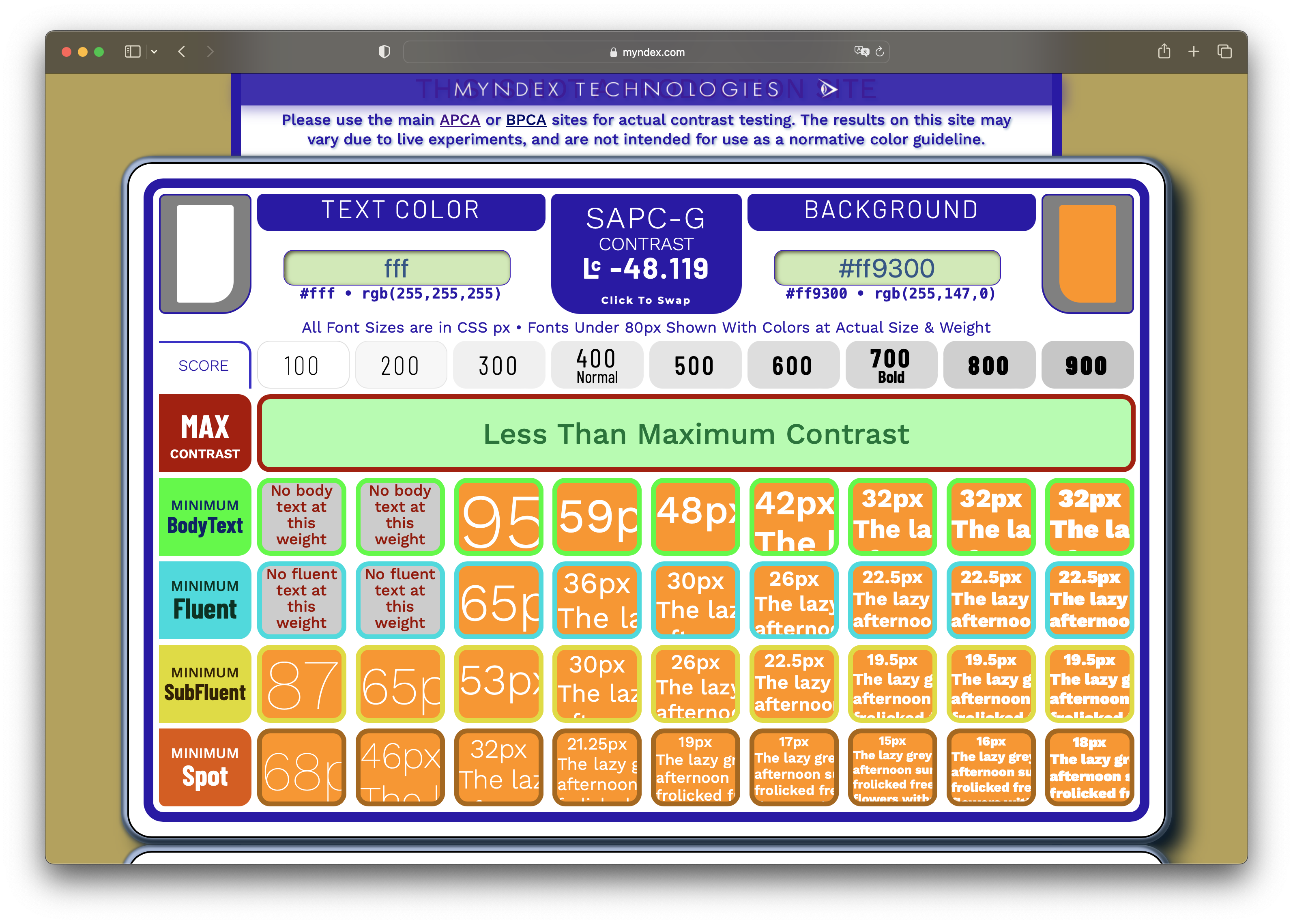
The APCA Readability Criterion has three levels of conformance - Bronze, Silver, and Gold.
The Bronze level is the minimum conformance level in ARC, generally covering only primary content text. Indeed, it defines use cases for "body text" and "other content text,” not covering spot texts such as disabled, placeholder, ancillary, and decorative text. In addition, there is no specified minimum font size and no requirement to compare the used font to a reference font weight or size.

The Silver level covers all text content. The Bronze's "other content text" is here detailed as "fluent text,” "large fluent text,” and "sub-fluent text.” Spot texts like disabled, placeholder, ancillary, and decorative text also have their recommendation. According to the Lc contrast value, texts have a recommended font weight and size. The minimum font size for content is 13px, based on an x-height ratio of 0.5 (minimum x-height of 7.5px), while the minimum font size for non-content text is 10px.

Finally, the Gold level enhances the Silver requirements. The font must be compared to a reference font weight and size to obtain the deltas to apply to the recommended values. The minimum font size for content text is 18px, based on an x-height ratio of 0.5 (minimum x-height of 9px), while the minimum font size for non-content text is 12px.
The APCA algorithm significantly improves the Color Contrast Ratio method for evaluating color accessibility. It is advisable to start implementing it as soon as possible to improve readability and expand the pool of users who can enjoy the experiences we design since there is no denying its effectiveness and usefulness.

However, it's worth noting that the creators of the APCA Readability Criterion (ARC) are actively involved in developing WCAG 3 as part of the task force and subgroups. This indicates that the APCA method will eventually be integrated into other standards, including ISO and WCAG. However, it is crucial to remember that it is currently a separate and independent set of guidelines and should only be referred to as a work in progress.
It's important to note that many regulations and accessibility standards still rely on the old Color Contrast Ratio method described in WCAG 2. If compliance with those standards is necessary, using color combinations that are valid for both algorithms is highly recommended to ensure your content is accessible to everyone.
Myndex Research provides the following conversions for WCAG 2’s AA and AAA levels:
You can find more detailed information on how to apply the principles of the APCA method while remaining within the boundaries of WCAG 2 following the WCAG 2 Compatibility & Enhancements guide here.
The APCA algorithm represents a significant advancement in creating interfaces that many users can use by defining truly accessible colors. Even if, at first glance, this algorithm may simplify our work by allowing us to use brighter colors we couldn't before, it's important to note that this comes with some downsides.
Starting from the conformance level Silver, not only do we have to take two more variables into account – font size and weight – but also the role the text plays within the semantics of the interface begins to become important.
Programmatically discerning the semantics of a text is something that the tech world has struggled with for decades, and we are just starting to make it more manageable thanks to the advent of AI. It means it will be challenging to create tools that can assist us in auditing the accessibility of interfaces according to the APCA recommendations a posteriori.
In our experience, it is never too late to make your interfaces accessible. Still, the best practice is to design the accessibility of a product from day one, as the effort would grow exponentially the further you progress in design and implementation.
At Buildo, we believe that technology should be an inclusive tool everyone can use, regardless of their abilities or disabilities. In line with this belief, we aim to design and implement software that prioritizes accessibility from the beginning.
To help our clients achieve accessibility compliance, we offer an Accessibility Audit, which enables them to cater to all users and meet legal requirements. If you want to learn more about the audit, check out our use case on the experience with Gruppo San Donato.
Agnese is an Interaction Designer at Buildo, specialised in UI and Design Systems. She loves transforming complex interfaces into scalable systems, with an eye for accessibility.
Are you searching for a reliable partner to develop your tailor-made software solution? We'd love to chat with you and learn more about your project.


